



Primary colour version
Use on white or light, simple backgrounds.
Presenting the Resus name and values consistently.
The sprout and cultivated-field motifs within the Resus wordmark evoke agriculture and growth. Preserve the original shape and proportions for a consistent brand image.
Choose the original colour, black or white version that provides sufficient contrast with the background.
Use on white or light, simple backgrounds.

Use for monochrome printing or where colour reproduction is limited.

Use on dark backgrounds to keep the logo clearly visible.
Using H as the logo height, allow a minimum clear space of 0.25H on every side.
Keep the sprout motif and lettering clear in every medium. Use the dedicated icon for small spaces such as favicons.
Preserve the colour logo’s distinctive gradient. Use the values below as references for digital media.
#387235 · RGB 56 / 114 / 53
#669E57 · RGB 102 / 158 / 87
#000000 · RGB 0 / 0 / 0
#FFFFFF · RGB 255 / 255 / 255
Do not stretch or compress the width or height.
Do not alter the colours or gradient.
Do not separate the lettering or sprout motif, or substitute another typeface.
Avoid busy photographs and backgrounds with brightness similar to the logo.
Download the colour, black and white logo versions.
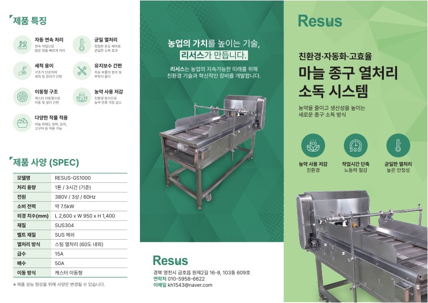
Product catalog · Korean
1 / 2